/ art © A K Segan
SWD 41
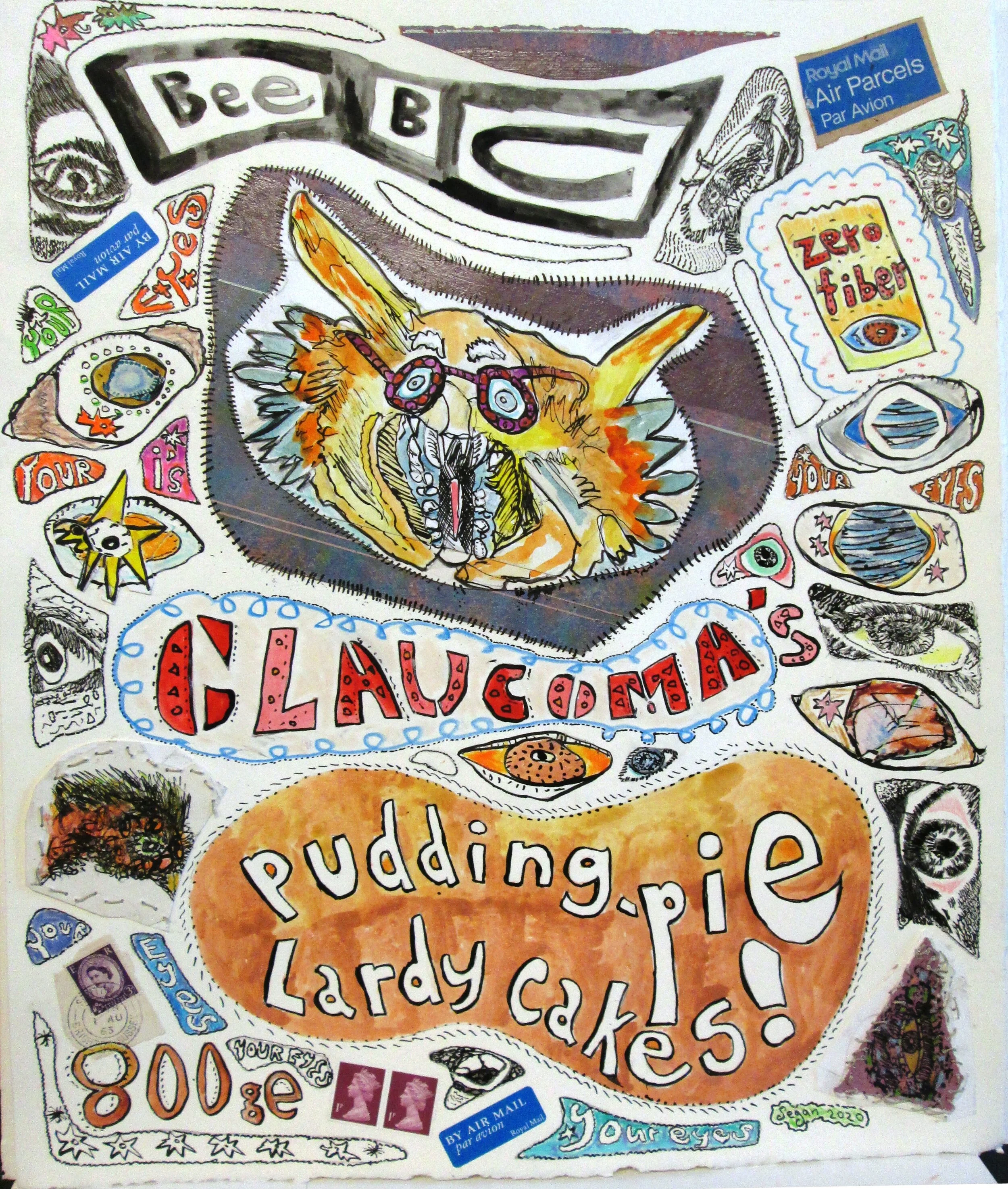
BeeBC Glaucoma's Pudding-Pie Lardy Cakes
Art: august 2020
drawing paper Size: 18 inches H x 15 W [45.72 cm. H x 38.1 W]
Media: Ink; colored pencil; gouache; stitching; 3 British postage stamps; 2 British postal airmail stickers; found scrap colored paper (at the very top, and underneath the CATaractio drawing in the center)
SWD 40 & SWD 41 are framed together in one frame, size: 28 in. H x 39 W [71.12 cm. H x 99 W]
As is the case with far too many websites on the internet, including those of news agencies, newspapers, tv news stations, news magazines, etc., the BBC website is not designed in vision-healthy, readable nor accessible black, high-contrast type-font and text.
With the exception of heading words (following the Microsoft model of destruction of common-sense fundamentals of graphic design), most of the text in the BBC website is displayed in light-value, low-contrast type. This graphic design is a terrific strain on vision and eye health to anyone reading light-value, extremely light-value, low-contrast and/or nearly zero contrast type.
(No) thanks to Microsoft and their subdivisions, and embraced by Facebook and their subsidiaries, and Google and their subsidiaries, e.g. Yahoo, flickr, Youtube, etc.,, this vision unhealthy graphic design has morphed into all manner of hard-copy publication graphic design, from small, e.g. business cards, to large, e.g. billboards, and all sizes in between.
As any optometrist and optician worldwide will confirm, there are no prescriptions for corrective eyewear for light-value, low-contrast type. And that helps explain why optometrists only project apha-numerics (letters, numbers) in black, high-contrast and bold type during patient eye-exams.
Tags: BBC News, BBC website, BBC accessibility, BBC website accessibility, BBC graphic design, BBC website graphic design, vision healthy graphic design, vision healthy website design, eye healthy website, eye healthy website design, BBC graphic design.jpeg, BBC News.jpeg, BBC website.jpeg
/ art © A K Segan
/ art © A K Segan


